Version 8.1 adds a new option for controlling the alignment of the library tabs. This option is called Static Multi-Row and affects how tabs are placed in the Bible, Book, and Commentary panels.
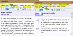
Normally, a tab control in Windows software holds to a tabbed folder paradigm. This means that the active tab is always “attached” to the contents below it. If there is more than one row of tabs, clicking a tab in an upper row will move the row down so that it is connected to the contents for the tab. This is how it has always been in SwordSearcher in previous versions. This image demonstrates how the top row “moves down” if one of its tabs is selected:

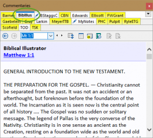
Over the years many users have reported that this behavior can be confusing, especially at first. So in SwordSearcher 8.1, a new option was added to fix tab positions regardless of which is active. This is called Static Multi-Row and looks like this:

The BibIllus tab is active, but it retains it’s top-row position so that it still appears alphabetically placed.
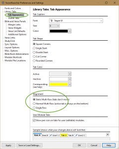
During beta testing, this new option was liked so well by testers that it is actually the new default setting. So to use this, you don’t need to change anything. However, if you would like to change the behavior, the old alignment method is still an option.

Choose Normal Multi-Row to use the previous behavior (which is more consistent with other Windows controls). Additionally, you can choose the Single Row option if you do not want multiple rows of tabs at all.
It can also be helpful to change the color of the Active or Inactive tabs here, so that the active tabs “stands out” a bit more. Experiment with the color settings to see what works best for you.
You can also change the shape of the tabs as well. The default setting of Square Corners is the most compact tab style. See what you like best!